PROJECT GOAL
How might we make the reading and search experience on the Wikipedia Android app more accessible to users with disabilities?
How can this experience become more compliant with WCAG guidelines?

MY KEY CONTRIBUTIONS
In this project, I contributed to the accessibility audit, issue synthesis, persona-based evaluation, and recommendation strategy.
I evaluated Wikipedia’s language switching and media playback accessibility using WCAG 2.1/2.2 standards and Android accessibility testing. Across these two areas, I audited 23 accessibility criteria and identified multiple Tier 1 and Tier 2 accessibility issues.

DELIVERABLES
Accessibility Audit Spreadsheet
Slides

*Click each picture to visit different deliverables.
OVERVIEW
Rather than treating accessibility as a compliance checklist, this project focused on understanding how accessibility gaps affect real user behavior, orientation, and confidence during information discovery and reading.
Wikipedia is one of the world’s most widely used knowledge platforms, serving millions of users across different languages, devices, and accessibility needs. However, even small accessibility barriers can significantly disrupt how users search, read, and navigate information.
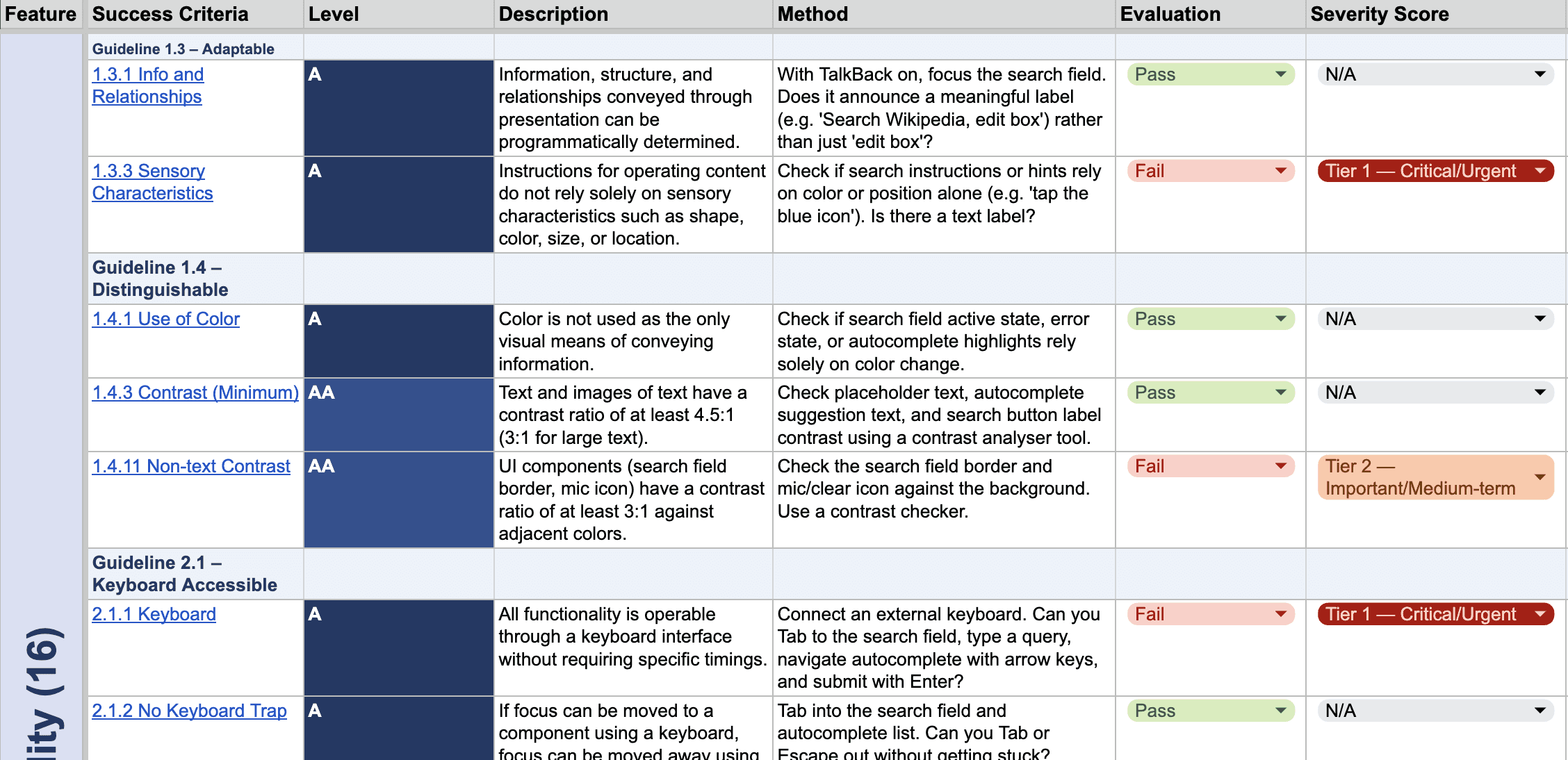
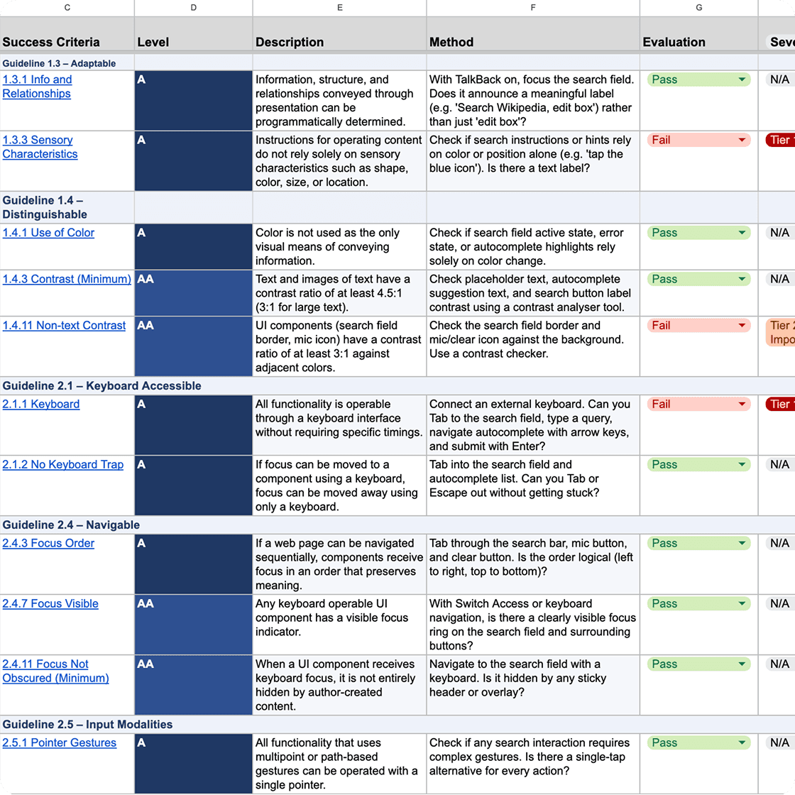
Our team conducted an accessibility audit of the Wikipedia Android app, focusing specifically on the Reading & Search experience. Using WCAG 2.1/2.2 standards, Material Design accessibility guidelines, and Android accessibility testing, we evaluated how the app performs for users relying on assistive technologies such as TalkBack, Voice Access, captions, font scaling, and keyboard navigation.
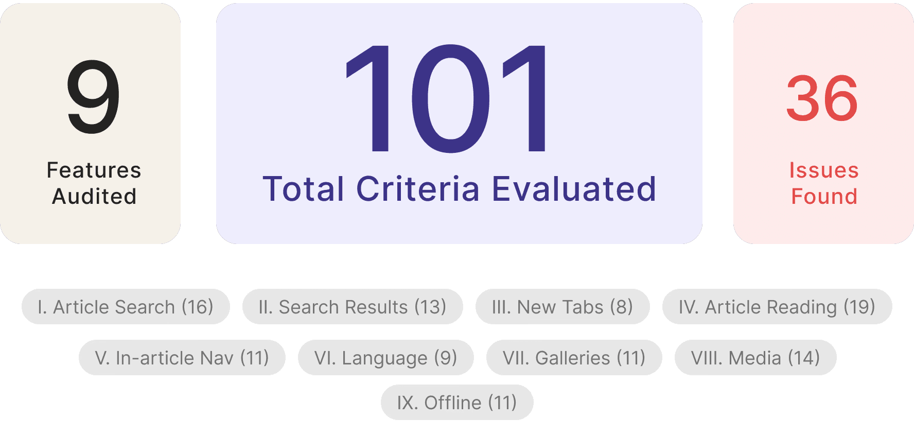
Across 9 evaluated experience areas and 112 accessibility criteria, we identified 35 accessibility issues, with nearly 70% classified as Tier 1 critical violations.
Client
Wikipedia Android App
Timeline
2 month
Role
UX Researcher, Accessibility Auditor, UX Strategy Designer
Team
Anli Huang, Rohini, Tracy, Youyuan, Thalia
Methods
WCAG Compliance Review, Accessibility Testing, Heuristic Audit
Focus Area
Reading & Search Experience

RESEARCH & EVALUATION PROCESS
Our process followed three phases: secondary research, persona development, and accessibility evaluation.
Our evaluation combined secondary research, persona-driven analysis, and accessibility testing to examine how different users experience Wikipedia’s reading and search flows.
Step 1 Secondary Research
We conducted secondary research based on Wikipedia user feedback and Google searches to identify and understand 5 different disability conditions and their accessibility challenges.

Step 2 Persona
Based on the research findings, we developed two personas showing combinations of disabilities commonly associated with challenges in wikipedia app usage.


Step 3 Evaluation
Using these personas as evaluative lenses, we assessed the Wikipedia mobile app to identify accessibility barriers, usability pain points, and opportunities for improvement.
EVALUATION FRAMEWORK
WCAG 2.1 / 2.2 Standards
Our audit used WCAG 2.1 and 2.2 guidelines as the primary accessibility evaluation framework, focusing on how users perceive, navigate, understand, and interact with the Wikipedia Android app experience.
We evaluated both Level A and Level AA criteria across reading, search, language switching, navigation, image viewing, and media playback flows.
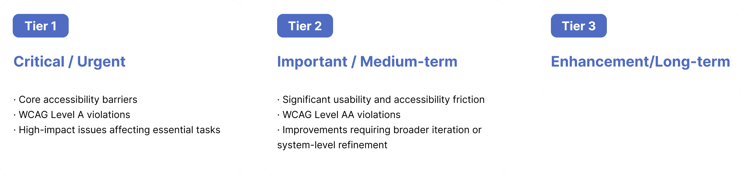
Severity Prioritization
To prioritize findings, we grouped issues into three severity tiers based on user impact, task criticality, accessibility barriers, and implementation feasibility.
AUDIT RESULTS

Nearly 8 in 10 identified issues were classified as critical.
This suggests that the most urgent accessibility gaps are concentrated in core access and interaction flows, especially for screen reader users, keyboard users, users with deaf, and users with low vision or motor limitations.
WHAT WORKED WELL
Before identifying gaps, we also recognized areas where the Wikipedia Android app performed relatively well.
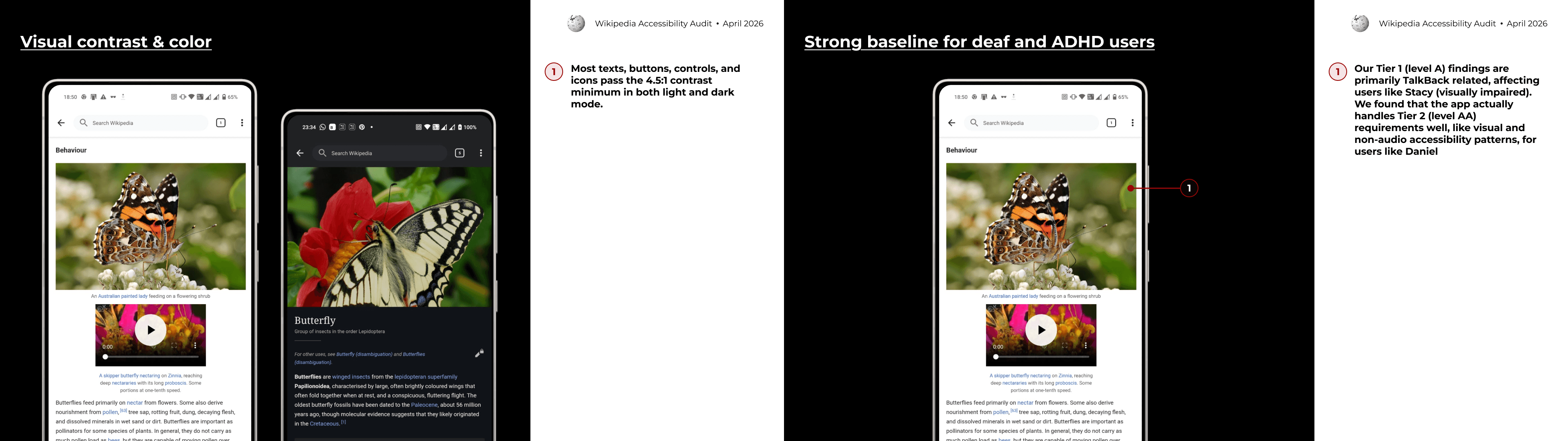

These strengths are important because they show that the app already has a solid foundation for accessible reading. The main opportunity is not to redesign the entire experience, but to fix the interaction points where accessibility support breaks down.
FINDINGS AND RECOMMENDATIONS
Tier 1 Overview
We identified 27 Tier 1 violations across the Reading & Searching experience.
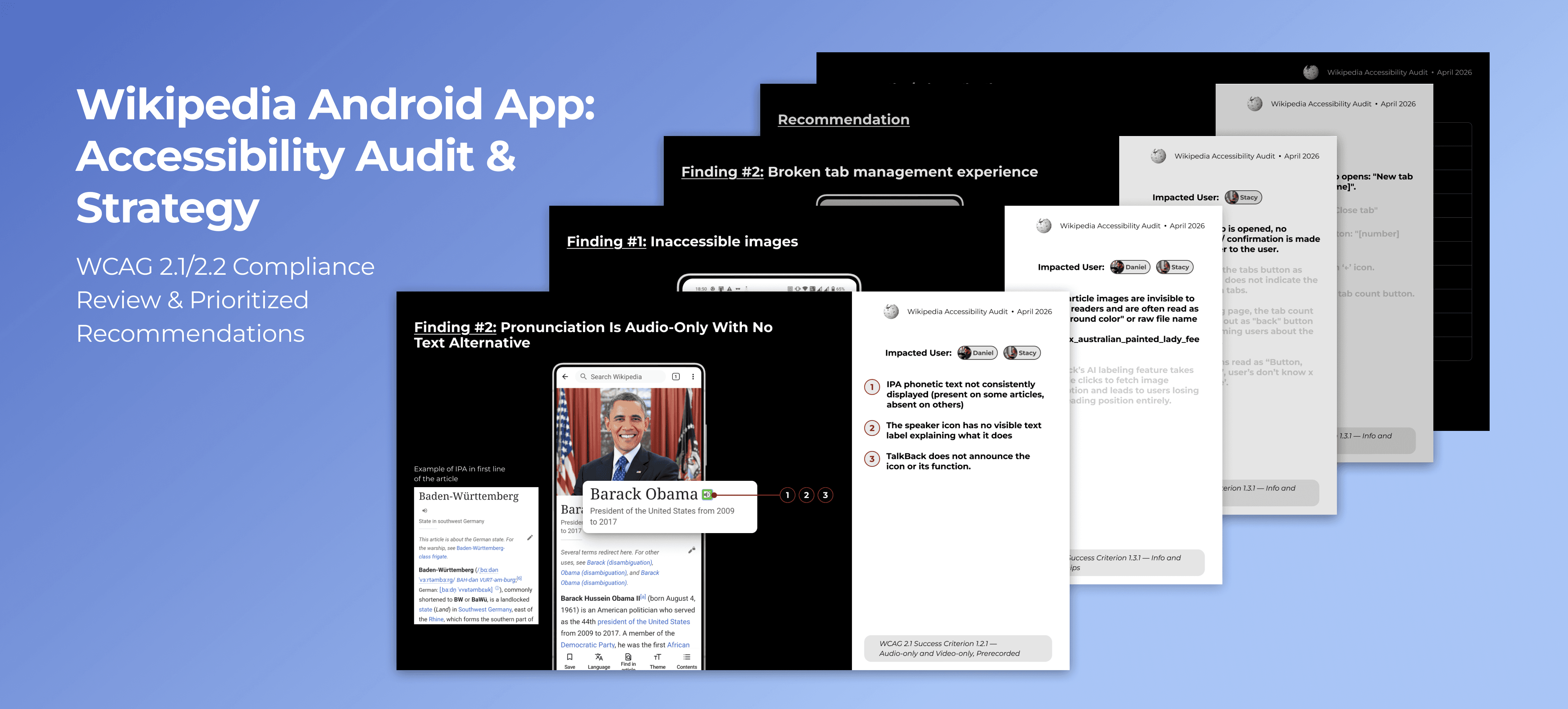
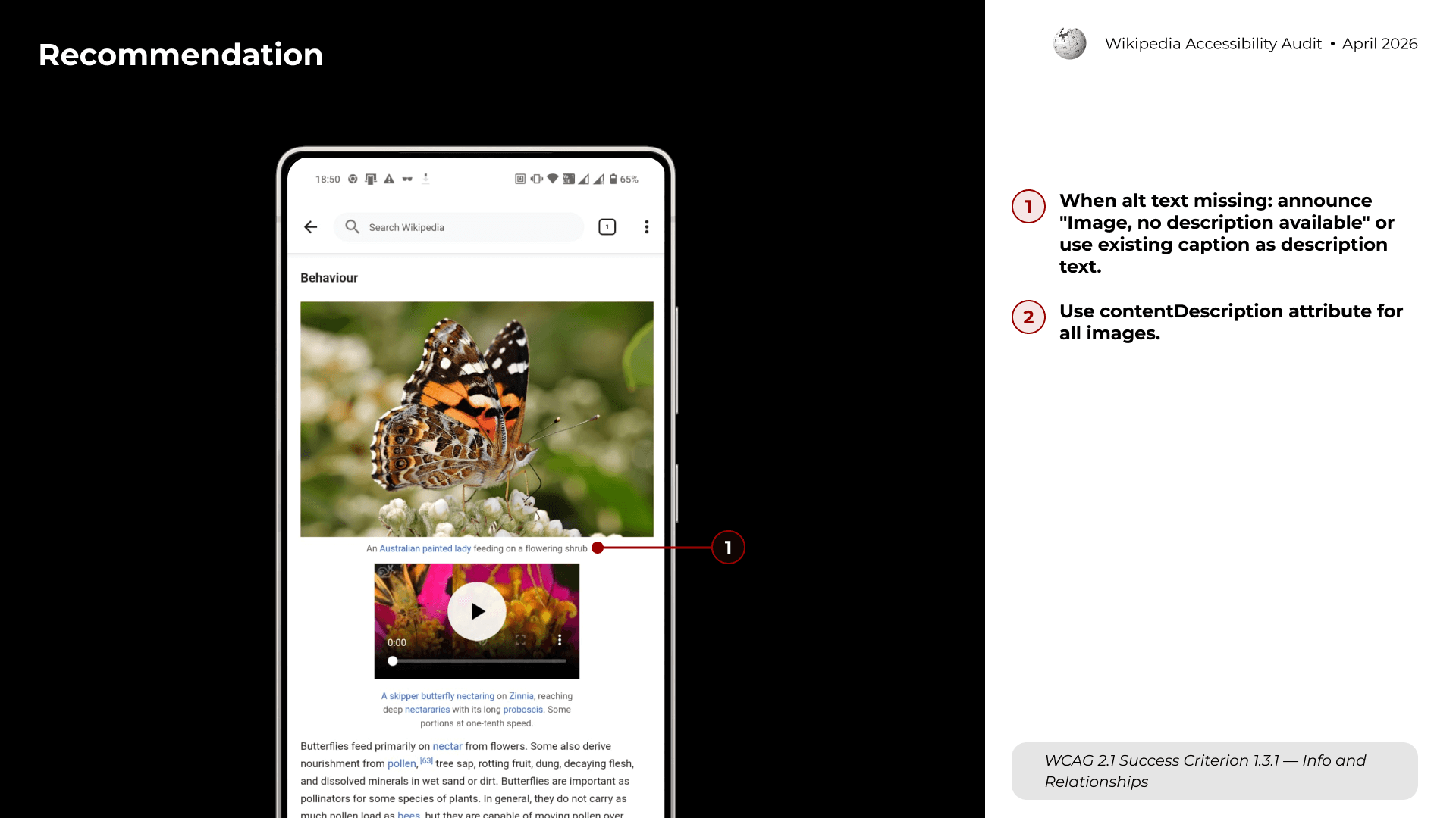
Finding #1: Inaccessible images

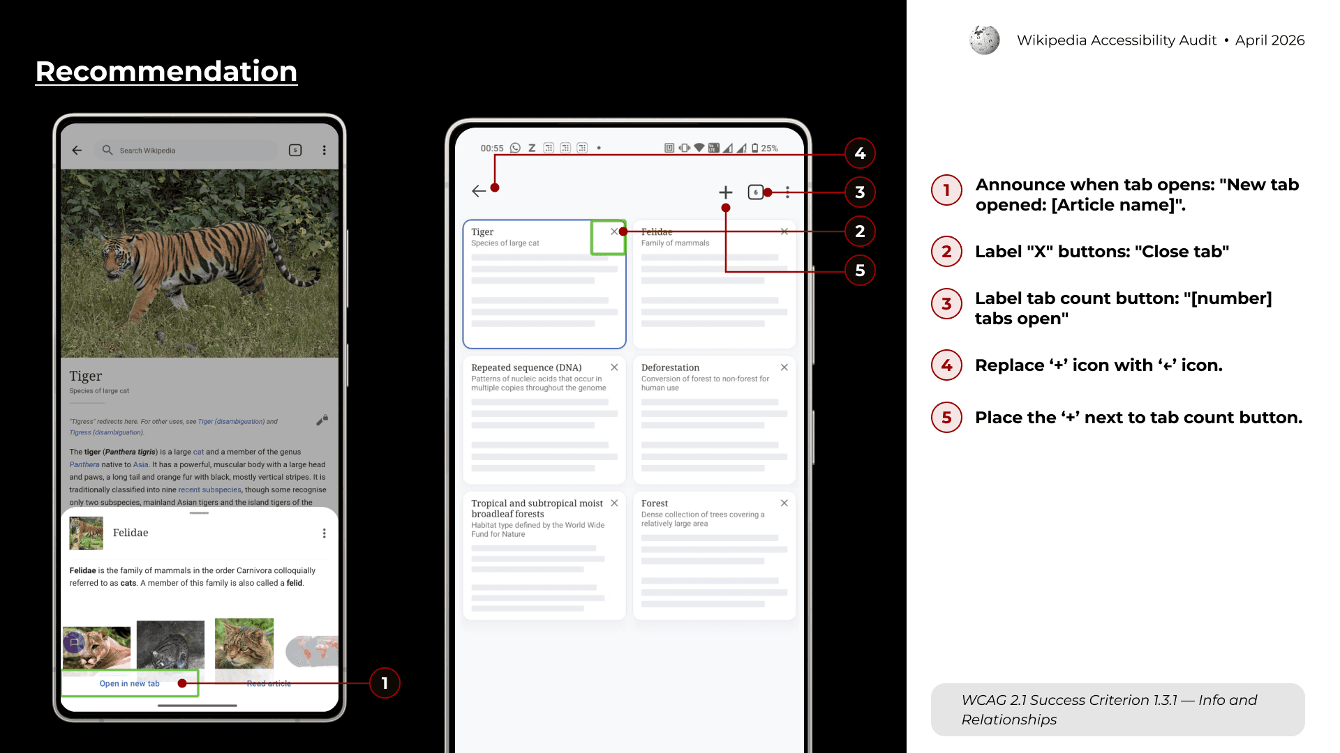
Finding #2: Broken tab management experience

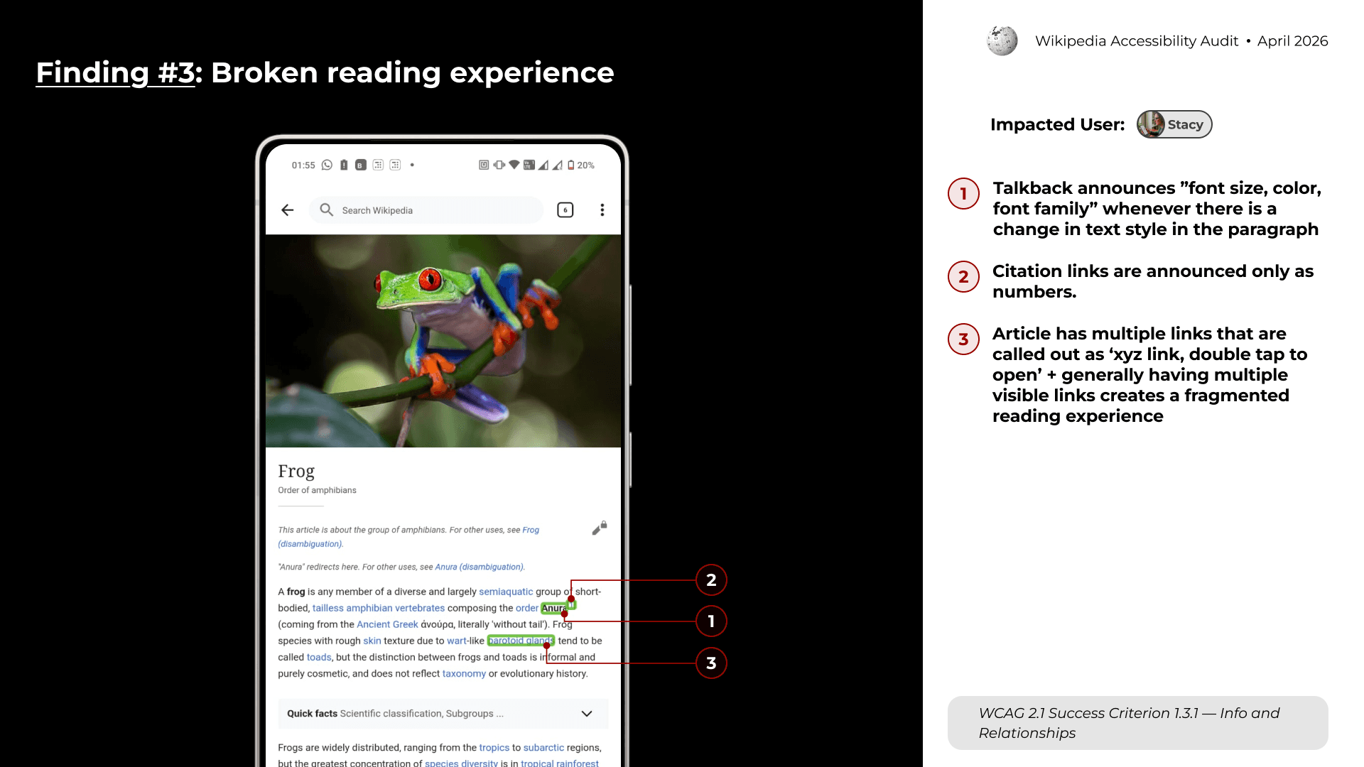
Finding #3: Broken reading experience

Finding #4: Search incompatibility with assistive tech


Tier 2 Overview
We identified 8 Tier 2 findings across the Reading & Search experience.
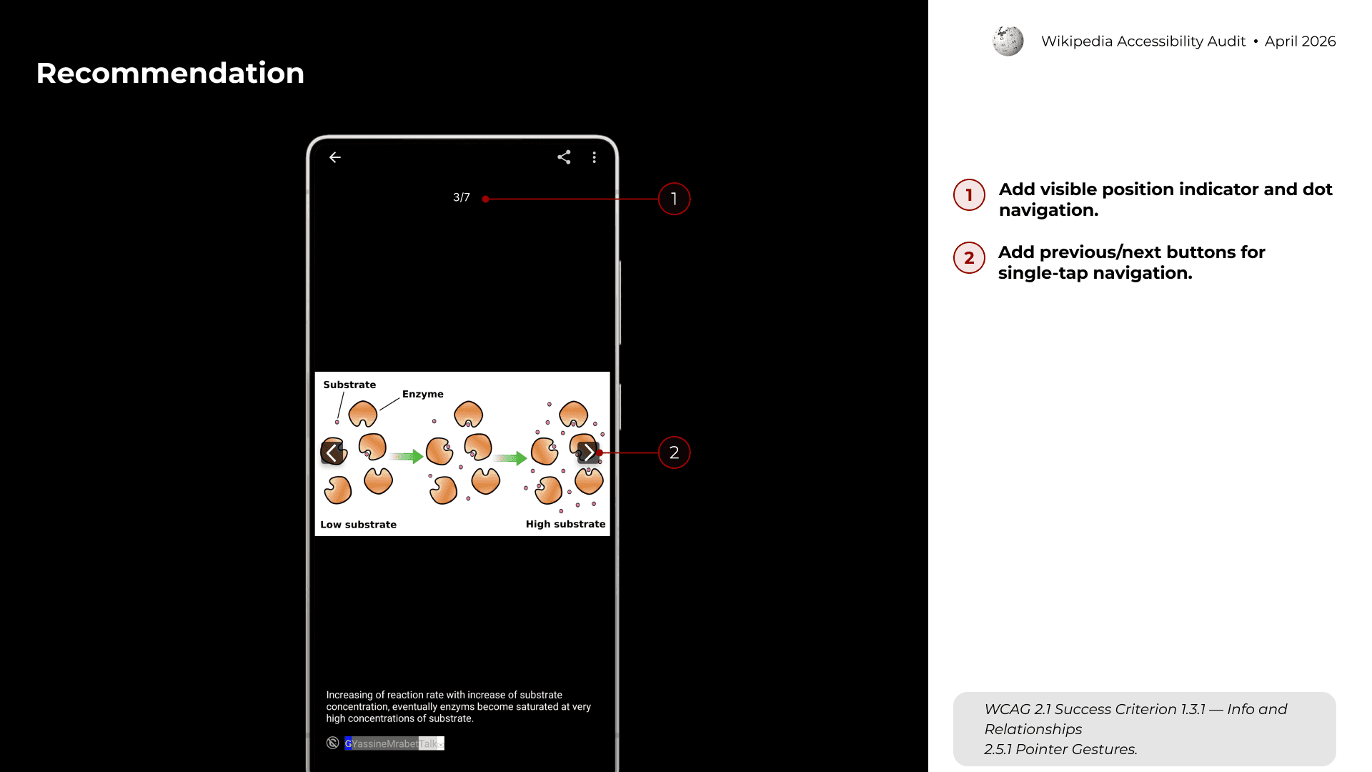
Finding #1: Gallery Has No Visible Position Indicator

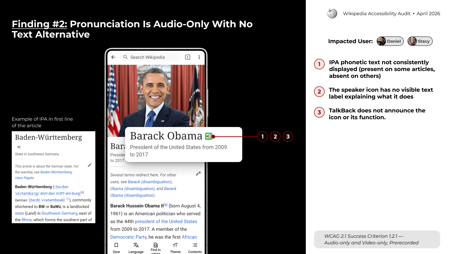
Finding #2: Pronunciation Is Audio-Only With No Text Alternative

DESIGN OUTCOME
The final output was an accessibility strategy deck for stakeholders.
The recommendations focused on improving both accessibility compliance and real-world usability. Instead of treating accessibility as a checklist, the strategy connected each issue to user impact, task flow, and implementation priority.
REFLECTION
This project changed how I understand accessibility evaluation. It also helped me see accessibility not as a separate layer, but as a core part of interaction design.

"Before this audit, I often thought of accessibility as a set of standards to check against. Through this project, I learned that standards are only the starting point."
"The biggest lesson I took away is that accessibility is about continuity. Users need to stay oriented across actions, modalities, and system states. When that continuity breaks, even a small missing label can become a major barrier."
Back to Top