Back to Top
DESIGN CHALLENGE
How might we help international museum visitors quickly find practical visit information, understand collection experiences, and confidently choose the right ticket on mobile?
The Thyssen-Bornemisza website was visually strong and generally well received by participants. However, during mobile visit-planning tasks, users repeatedly struggled to locate basic information, interpret ticket options, and understand where certain collection features lived.
The core challenge was not whether the website contained the right information. In most cases, it did. The real issue was whether users could find, interpret, and act on that information at the moment they needed it.

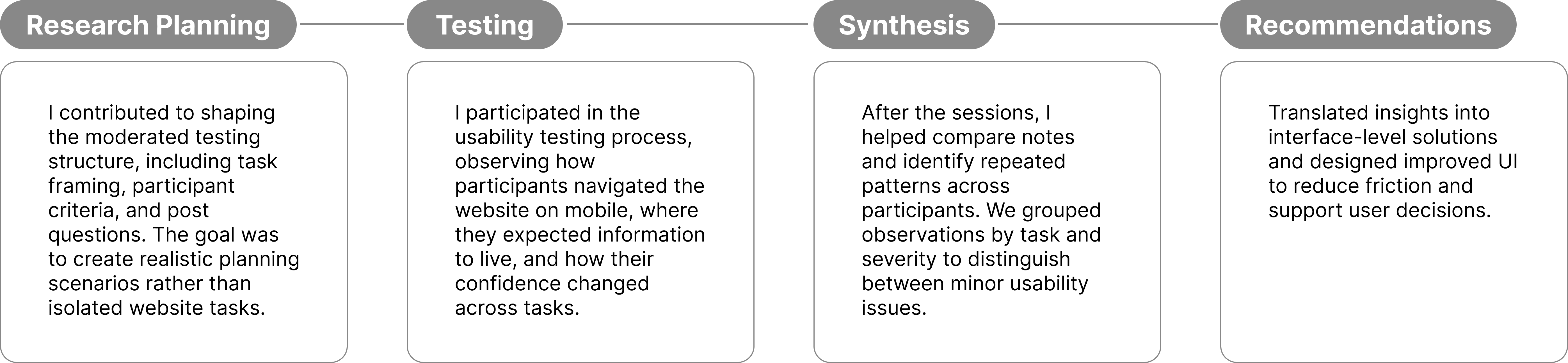
MY KEY CONTRIBUTIONS
From test planning to insight synthesis, I helped turn observed user friction into actionable interface recommendations.
DELIVERABLES
Moderated Testing Report
Slides
*Click each picture to visit different deliverables.
OVERVIEW
Testing the museum visit-planning experience for mobile-first international visitors.
The Thyssen-Bornemisza National Museum is a major art museum in Madrid, Spain. Its permanent collection includes nearly 1,000 paintings spanning Western art from the 13th to the 20th century, along with temporary exhibitions.
Our study followed a client intake meeting with Elena Villaespesa, Head of CX, CRM, and Digital Analytics. Based on this discussion, we focused on key website areas related to visit planning.
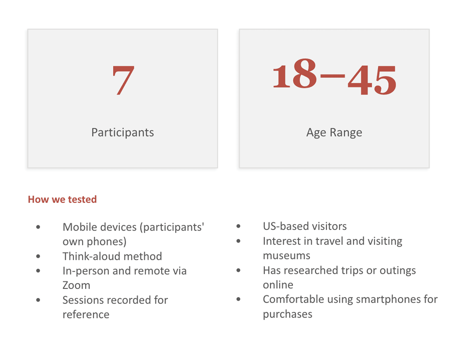
This moderated usability study evaluated the mobile experience of the Thyssen-Bornemisza National Museum website, focusing on visit planning, collection discovery, and ticket purchasing. Through seven sessions with US-based participants, we identified recurring navigation and information architecture issues and developed three actionable design recommendations.
Client
Thyssen-Bornemisza National Museum
Timeline
2 month
Role
UX Researcher, Usability Tester, UIUX Designer
Team
Anli Huang, Michael Bove, Yuxuan Xia
Methods
Moderated Usability Testing, Interface Recommendations
Responsibilities
User Research, Tree Testing, Usability Testing, Insight Synthesis, IA Design, Task Flows, Wireframes, Prototyping, Interaction Design, Design System, Illustration, Brand Integration

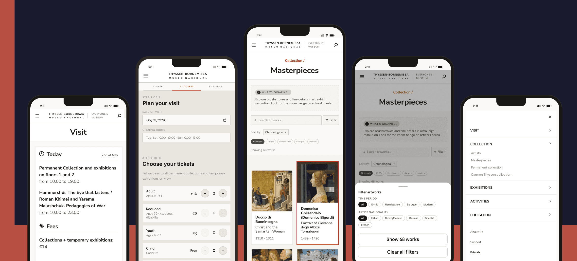
Task1 Hours and Free Entry


RESULTS AND RECOMMENDATION
The website was visually appealing, but key visit-planning information was harder to find than users expected.
The study was conducted through moderated usability testing sessions using participants’ own mobile devices. Each session lasted approximately 30 minutes and used a think-aloud protocol, where participants verbalized what they were looking for, expecting, and feeling throughout the experience.
Participants responded positively to the website’s visual design and clean aesthetic. Once they found the information they needed, they generally found the content clear and understandable.


Participants responded positively to the website’s visual design and clean aesthetic. Once they found the information they needed, they generally found the content clear and understandable.
The strongest pattern across the study was a mismatch between where users expected information to be and where the website actually placed it. Participants often looked in reasonable places, such as the Visit page for opening hours or the Tickets page for ticket guidance, but the information was either buried, split across locations, or presented in a way that required extra interpretation.
RESEARCH & ANALYSIS
We focused on how visitors actually plan: first finding practical information, then exploring what to see, and finally deciding what to buy.
The study was designed around a realistic travel-planning scenario: participants were told they were planning a trip to Madrid and wanted to visit the Thyssen-Bornemisza Museum that week. Starting from the homepage, they were asked to complete three tasks that reflected a typical visitor journey.
Moderated Mobile Testing
The study was conducted through moderated usability testing sessions using participants’ own mobile devices. Each session lasted approximately 30 minutes and used a think-aloud protocol, where participants verbalized what they were looking for, expecting, and feeling throughout the experience.


Sessions were conducted both remotely and in person, allowing us to observe not only task completion but also hesitation, confusion, navigation behavior, and non-verbal reactions during the experience.
After each task, participants answered follow-up questions about task difficulty, expectations, and areas of confusion.
Participants
Recruiting International, Mobile-First Visitors.
RESEARCH TASKS
Participants were asked to imagine they were planning a trip to Madrid and wanted to visit the Thyssen-Bornemisza Museum that week, starting entirely from the homepage.
The study focused on three key stages of the visitor journey: finding practical information, exploring the collection, and making ticket decisions.

Analysis Process
Once all seven sessions were completed, our team compared notes and recordings to pull out key observations and recurring issues across participants. We organized our findings using affinity diagramming, grouping observations onto sticky notes by theme and task to identify patterns across participants. From there, we evaluated each issue based on how often it came up and how much it got in the way of completing a task. This helped us prioritize the most significant problems and shape our recommendations for the museum.

*Click each picture to visit spreadsheet.
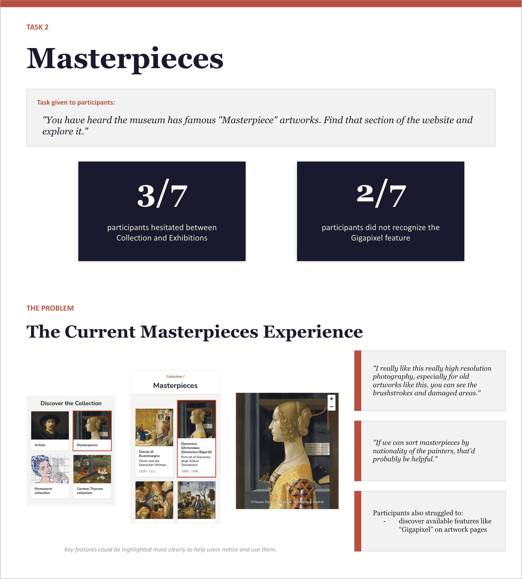
Task2 Masterpieces

Task3 Tickets


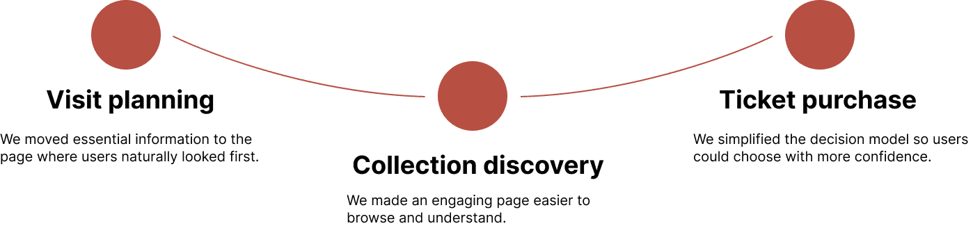
DESIGN IMPACT
The recommendations focused on reducing friction at the exact moments when visitors need clarity.
Across the three recommendations, our goal was not to redesign the entire website. Instead, we focused on targeted improvements that could align existing content with user expectations.
FINAL TAKEAWAYS
A beautiful interface still needs information architecture that matches user expectations.

"This project reinforced that visual quality alone cannot guarantee usability. Participants liked the museum website’s aesthetic, but still struggled when essential information was not placed where they expected it."
"The biggest lesson was that usability issues often appear in the gap between content availability and content findability. The website already had much of the information users needed, but the placement, naming, and structure made users work harder than necessary."